
Role
UX Designer (Team)
focus
Audit, Design, Testing, Accessibility
responsibilities
Helped audit and identify areas of improvements across our components and written content in our product suite.
Designed and maintained the system for the last several years. Identified and improved several components based on feedback and audits.
Developed a new color palette that ensures visually accessible designs that meets WCAG Level AA compliance. Ensured support for dark mode.
Collaborated closely with front-end developers during the implementation process and conducted a thorough design audit of completed components.

Color System, the palette expanded to include 10 colors.

Typography, the primary typeface was Inter and included a total of 9 variations.
Building the Design System
When I joined the company, the only available design resource was a limited style guide that covered colors, typography and limited set of components. The product suite lacked distinct branding and a unified product identity due to it's reliance on MUI. With the teams expanding and multiple projects underway, there was a pressing need for a centralized resource to maintain consistency and facilitate reuse across projects.
what we discovered
Duplication of frequently utilized components.
Poor accessibility across the UI.
Lack of design framework that can be easily shared and maintained.
Lack of unique identity due to dependency on Material UI.
The journey
We began by conducting a comprehensive audit of the existing components and colors. This gave us a clear understanding of the current state and what needed to be changed.
We took the opportunity to study other design systems to learn from their successes. In particular, we were impressed by Shopify and IBM's design systems, which included well-defined guidelines, reusable components, and a strong focus on accessibility.
We established design principles and guidelines that would guide the development of the new design system and serve as a roadmap for the design team to make decisions.
We designed the components, testing them across different scenarios to ensure they were worked across a range of needs and interfaces.


Content Guidelines, includes principles, rules and formatting guidelines.
color & accessibility
Our color scheme went through a few iterations. The initial palette had some accessibility issues in certain situations and limited grades which meant we could not extend it to support dark mode. I used Leonardo to extend and modify the palette. With the upgraded palette, you can confidently choose two colors across different grades and get a consistent contrast ratio. We ensured the palette conformed to WCAG 2.1 Level AA across a range of usage.

Accessibility, we ensured our visual designs were accessible and conformed to WCAG 2.1 Level AA.

Color System, the palette included a range of colors with consistent luminescence for every grade.
learn about accessibility
I prepared a document summarizing key insights from WCAG 2.1 about color accessibility. This is the first in a series I aim to publish to the Figma Community.

Amazing feedback I received just days after posting in the Figma Community.


Button, we had 3 different styles (primary, secondary and tertiary) supported across a range of variations.
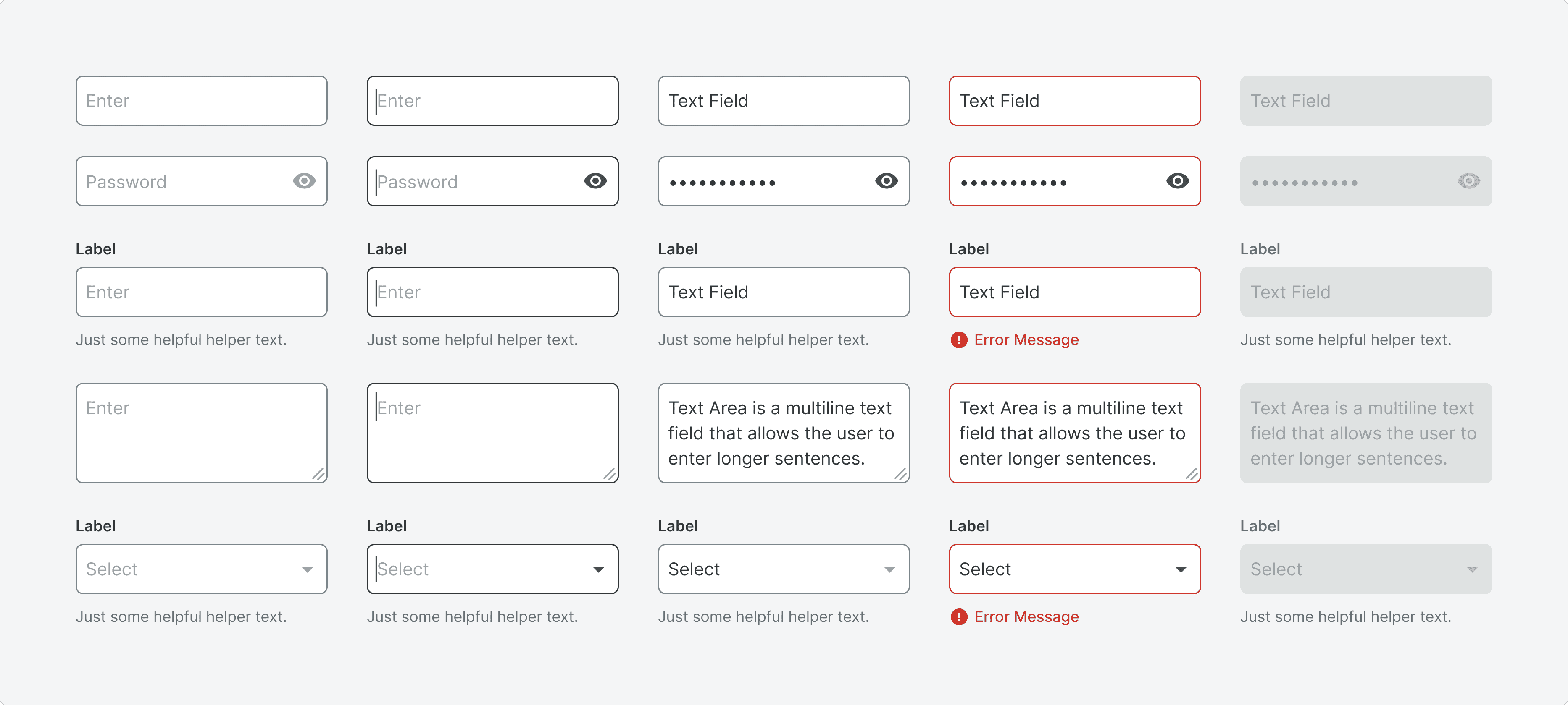

Text Input, we had both text fields and text areas supported across a range of variations.


Dropdown, there were multiple types of drop downs for use across a range of variations.


Tags, we had variety of tags supported for each color in the system.

Informational Banner, there were multiple types of banners, some actionable some informational.

Illustrations, we had of range of different states split into primary and secondary variants.
Figma
The design system was initially built in Sketch but we moved to Figma just a year after its creation. Figma has been amazing to design and maintain the system with its auto-layout, variants, version control and so much more.
Additionally, Figma's collaboration features have allowed us to work efficiently as a team and make sure everyone is on the same page. The ability to leave comments and make suggestions directly on the design has streamlined the feedback process and made it easier to track changes and updates.


Screenshots of the tool across a range of use.
auditing and feedback


Screenshots of the tool across a range of use.
lessons learned
Design systems are a continuous work in progress that needs to evolve and adapt with the needs of the products.
Getting executive buy-in is only half the battle, the actual one is fought as it gets developed. Teams without dedicated resources can make progress by prioritizing and adding components in each sprint.
Accessibility in code is just as crucial as accessibility in visual design. This includes providing alternative text for images, using proper heading structures, implementing keyboard accessibility, and ensuring compatibility with assistive technologies.